Mac OS X’s Aqua has matured very slowly over the last few years. It seems like many OS X users are tired of Aqua and ready for a new revolutionary GUI to compliment and enhance the experience of using a Mac. An increasingly popular theme for Apple’s latest applications have been smooth unified metal and dark glass. With each major update to one of Apple’s applications, its seems like the days with blue gel scroll-bars and candy bar progress bars are ending.
Its no question that Leopard will feature a new GUI, but no one really knows what it will look like. Its no doubt that Leopard will feature resolution-independent graphics support that will allow for greater resolution displays with the same and windows sizes. However, the details of the interface have not yet been revealed, but many are hoping that we will see the final announcement of Leopard features at Macworld 2007, where chances of a GUI announcement are high.
Apple Gazette has featured a new rumor from a supposed insider that has claimed that the new GUI that will replace Aqua will be nicknamed ‘Illuminous’. The report has no solid information on what the Illuminous theme will look like, but I believe I know exactly where Apple might be headed.
As I said, Apple’s latest trend in its software GUI is a darker, flatter, translucent, reflective, “illuminating” glass appearance. The GUI is also making headway beyond the sheer appearance, to window sizes, visual effects, icons, etc. Fullscreen applications will definitely be a hit in Leopard, to clear your desktop from clutter and manage your workspace more efficiently. Just like Aperture and iPhoto, imagine fullscreen browsing, video-editing, Garageband, iWork, etc. Sleek graphic effects when opening windows, files, applications, are also likely to be improved making the OS seem more alive, similar to the widget ripple effect. And with the new GUI change, I am also expecting Apple to replace their outdated icons. Ultimately, Apple is heading towards a sleeker, darker, simpler, livelier GUI.
Apple has been the leader in computer and GUI design for years, and Vista’s new Aero interface has probably provoked Apple’s design team to topping them off with a mind-blowing interface (that requires half of Aero’s hardware requirements). It would be a true disappointment if there was no sort of GUI announcement when Steve finished giving the major features in Leopard.
The dark translucent appearance Apple has developed over the last three years has seemed to have expanded to many of the operating system’s core applications. Here are a few of the many traces of the new dark glass appearance rumored to be featured in Leopard:
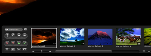
Aperture 1.5’s navigation window:
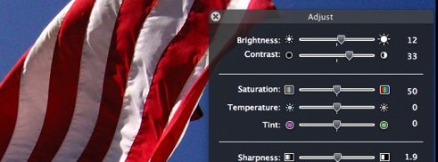
Photo’s Adjust Window:
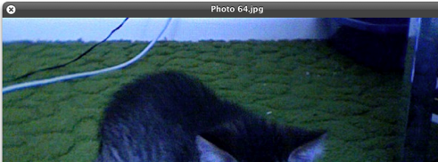
Leopard’s new QuickLook feature:
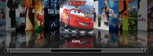
Front Row’s sliding dark glass:

iTunes 7’s new darker appearance: